
Understanding Color Theory in Fashion
Understanding color theory helps in creating a cohesive wardrobe where every piece complements each other. By grasping the basics, it’s possible to elevate one’s fashion game.
The Basics of Color Theory
Color theory revolves around three primary categories: primary, secondary, and tertiary colors. Primary colors include:
- red
- blue
- yellow
Mixing these creates secondary colors like:
- green
- orange
- purple
Tertiary colors result from combining primary and secondary colors, such as red-orange or blue-green. Knowing these categories aids in selecting pieces that align well.
How Color Wheel Works
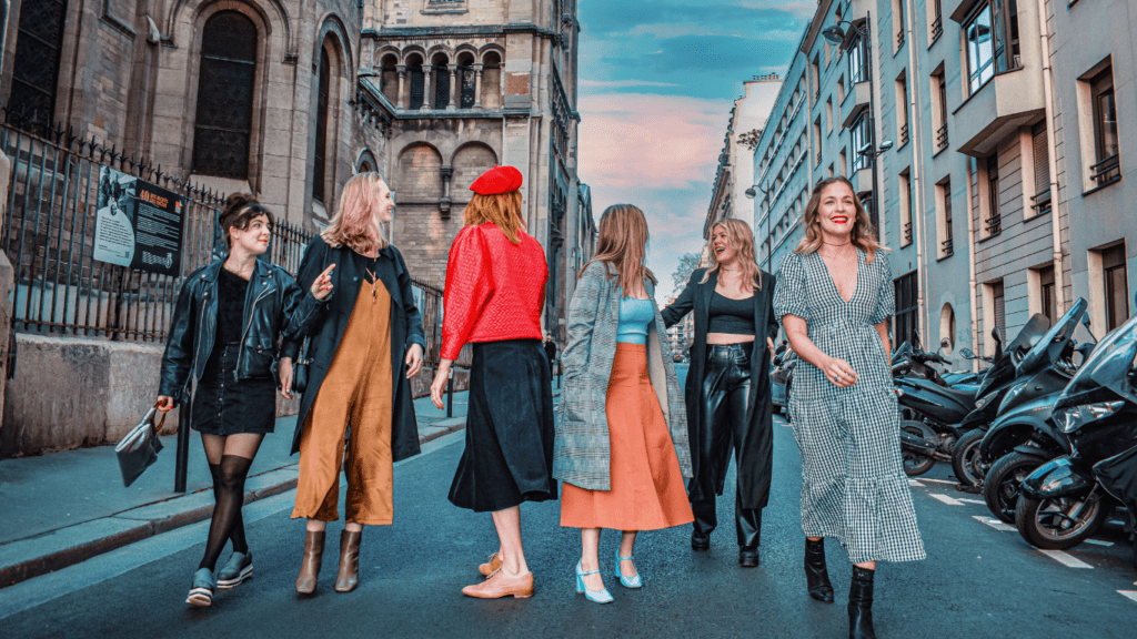
The color wheel visually represents color relationships. Complimentary colors are opposite each other, like blue and orange. They create vibrant contrasts. Analogous colors sit next to each other on the wheel, such as green, blue-green, and blue. They offer a harmonious look. Triadic colors form a triangle on the wheel, like red, yellow, and blue, offering balanced contrast. By using the color wheel, one can easily coordinate outfits that look cohesive and stylish.
Essential Color Combinations
Color theory isn’t just theoretical; it’s practical. Understanding essential color combinations enhances any wardrobe, ensuring every outfit looks intentional and stylish.
Monochromatic Schemes
Monochromatic schemes use variations of a single color. This combination creates a cohesive, easy-to-style look. For example, different shades of blue—navy, sky blue, and royal blue—can form a sophisticated ensemble. The key is to mix lighter and darker shades for depth.
Complementary Colors
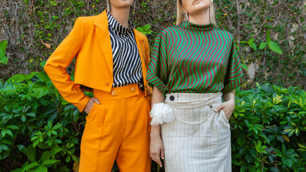
Complementary colors sit opposite each other on the color wheel. These pairs, like blue and orange or red and green, create a vibrant and high-contrast look. When combining these colors, balance them to avoid overwhelming the outfit. A navy dress with an orange scarf is a perfect example.
Analogous Colors
Analogous colors are adjacent on the color wheel, blending seamlessly. They create harmonious, comfortable outfits. Examples include yellow, yellow-green, and green. These combinations work well because they share a primary color, making them naturally cohesive.
Triadic Colors
Triadic colors form a triangle on the color wheel, offering balanced yet vibrant looks. Examples include red, yellow, and blue. Incorporate these combinations by choosing one dominant color and using the others as accents. A blue shirt with red and yellow accessories can create an eye-catching ensemble.
Use these essential color combinations to build a versatile, stylish wardrobe. Understanding and applying these principles ensures every outfit looks intentional and harmonious.
Building a Versatile Wardrobe

Building a versatile wardrobe requires thoughtful selection of base and accent colors, along with patterns. By focusing on these elements, you’ll always have outfits that match and express your style.
Choosing Base Colors
Base colors form the foundation of any versatile wardrobe. I recommend selecting neutral tones like black, white, gray, and navy. These hues are timeless, versatile, and easy to mix and match. For example, a black blazer pairs well with nearly any colored shirt or pant. Choosing neutral base colors ensures you can create numerous combinations without clashing.
Adding Accent Colors
- After establishing base colors, it’s essential to incorporate accent colors.
- These hues add personality and vibrancy to your wardrobe.
- Pick 3 to 5 accent colors that complement your base neutrals.
- Consider choosing accent colors that align with your favorite shades and skin tone.
- A navy base looks stunning with accents like mustard yellow, burgundy, and forest green.
By limiting accent colors, you maintain versatility without overwhelming your wardrobe.
Incorporating Patterns
Patterns bring visual interest to an outfit when used correctly. Start with basic patterns like stripes, polka dots, or plaids in neutral colors. For example, a striped shirt in black and white complements numerous base and accent pieces. Gradually introduce more complex patterns that incorporate your accent colors. Ensure the patterns are cohesive with your overall color scheme to maintain versatility.
Focusing on base colors, accent hues, and patterns ensures a versatile wardrobe that always matches.
Tips for Matching Outfits
Matching outfits can be straightforward and fun with the right approach. Understanding seasonal trends, mastering accessory use, and avoiding common mistakes can significantly improve your style.
Seasonal Color Trends
Colors vary by season, improving outfit coordination. For example, spring often features pastels like soft pink, lavender, and baby blue. Summer trends focus on bright hues such as coral, turquoise, and sunny yellow. Fall introduces earthy tones like mustard, burgundy, and olive green. Winter usually embraces rich, deep colors like navy, emerald, and maroon.
Accessorizing with Confidence
Accessories elevate any outfit when chosen wisely. Start with essential pieces like a classic watch, a pair of statement earrings, or a versatile scarf. Coordinate these accessories with your outfit’s base and accent colors for a cohesive look. For instance, pair gold jewelry with warm tones like burgundy or mustard, and silver jewelry with cool tones like navy or emerald. Mix textures, like leather belts or silk scarves, to add interesting layers to your ensemble.
Avoiding Common Mistakes
Avoid mismatched patterns to maintain cohesion. If wearing multiple patterns, ensure they share at least one color. Balance bold colors with neutrals to avoid an overly busy look. For example, a bright blue top pairs well with neutral black pants. Don’t ignore the importance of fit—properly fitting clothing enhances appearance more effectively than color coordination.
By focusing on these tips, you can create outfits that are stylish, cohesive, and reflective of your personal style.